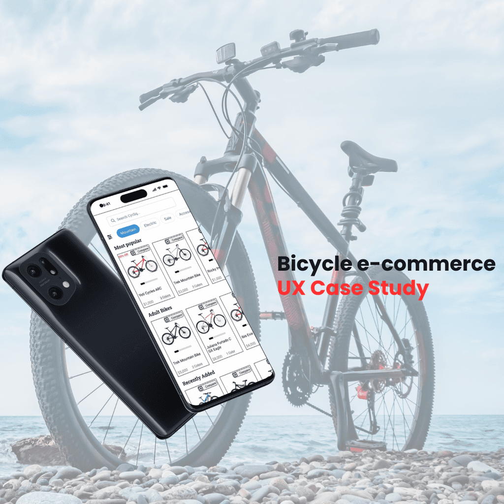
Cycliq (UX Case Study): Purchase bicycles like a pro
Timeframe:
1 Month
Role:
UX Designer
Tools:
Figma, Google Meet, Miro, Ludicd
Background
Cycliq is an e-commerce bicycle app that allows users to purchase high-quality bicycles for experts in bikes. The app allows users, particularly, those investing in bicycles, to have a seamless purchasing experience. Users are allowed to read through different categories of the bikes such as specs, descriptions, size charts, and reviews to make a satisfying purchase.
Problem
Product reach has shown that half of users open 7 items but abandon the site without adding items to the cart. Furthermore, approximately 70% of users who place items in the cart abandon the checkout process when they face the registration page. Currently, the app lacks a guest registration page and lacks relative features.
Solution
The goal was to improve the browsing and checkout experience to complete the checkout and increase revenue. By creating a guest feature at the checkout stage, users will be able to quickly make their purchase without creating a time costly account. Furthermore, by improving the browsing experience on relative features, users will be more inclined to proceed to the checkout stage.
Role
As a primary designer, I was responsible for competitive analysis, user research, research synthesis, design and ideation, and user testing. I created a project plan that set deadlines that extended across 1 month.
Research
Competitor Analysis
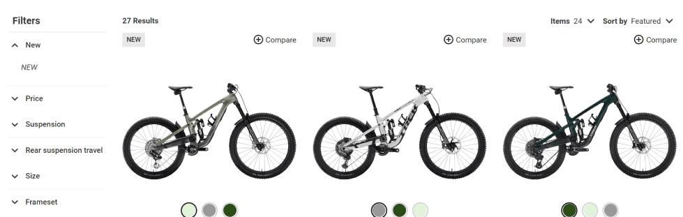
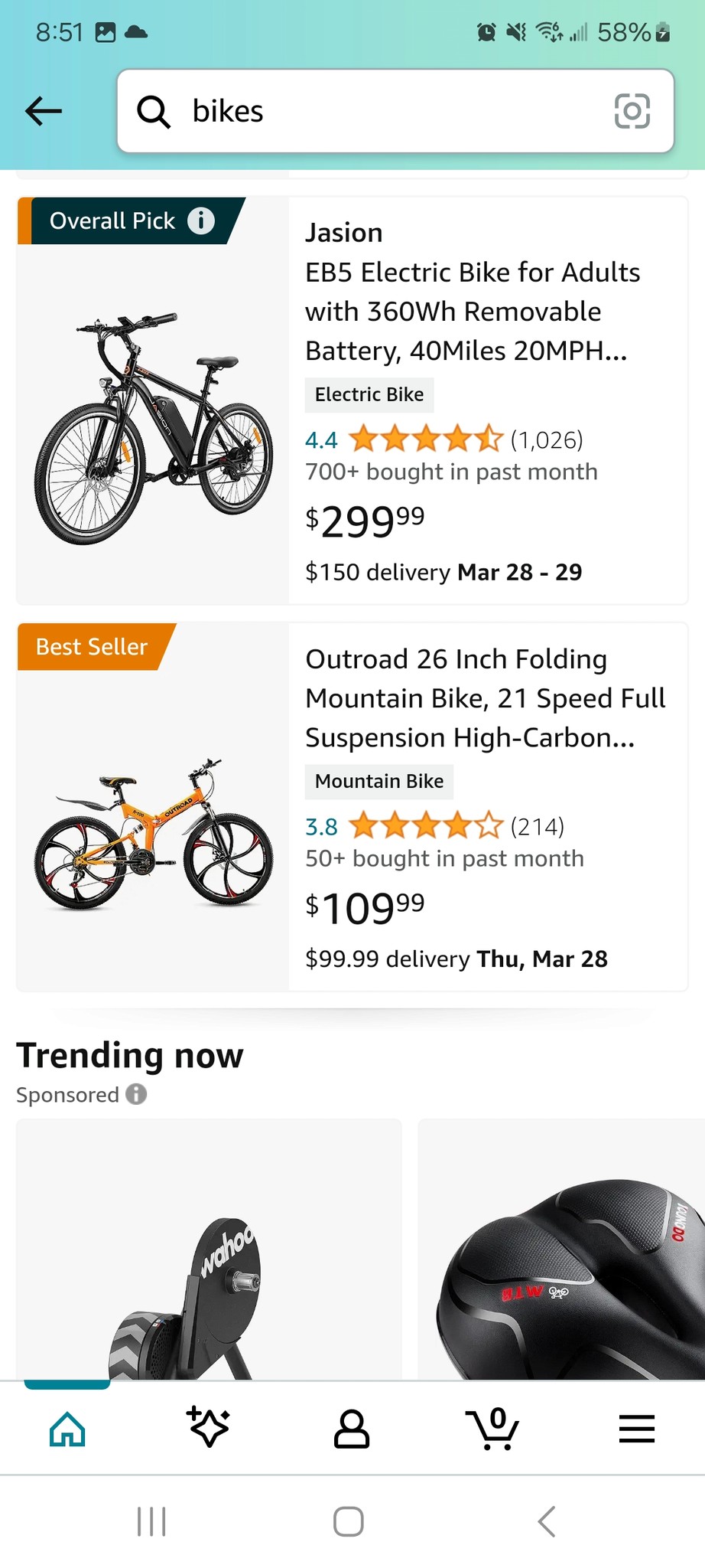
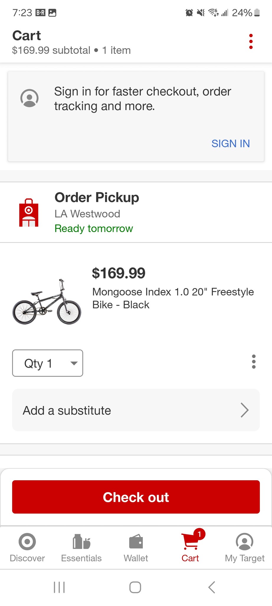
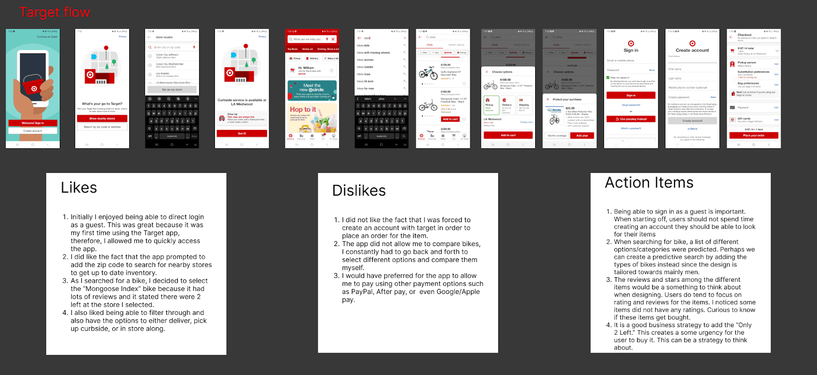
I began the research process by analyzing existing solutions for apps that sell bikes and various products. I focused my analysis on the user experience for bike purchases. I focused on three main apps: Target, Amazon, and TrekBikes.com.
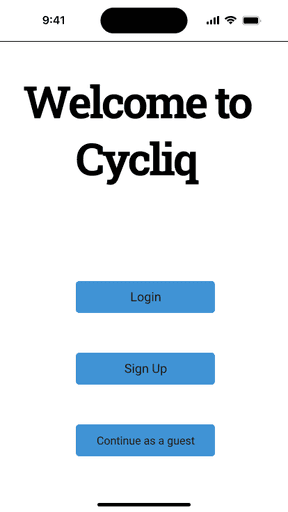
Completing this competitor analysis allowed me to make notes on potential pain points to avoid. Understanding these pain points allowed me to obtain seamless experience ideas to aid me with my ideation. For example, an action item I was able to obtain from this analysis was allowing the user to quickly access the app by continuing as a guest from the beginning and avoiding creating an account. Therefore, creating an experience where users already know they can use a guest option creates a faster browsing and checkout process.
Interview and Research Synthesis
Next, I began to conduct informational interviews to gain a deeper understanding of what users face when purchasing bikes at checkout. I conducted five informational interviews with users who currently enjoy riding bicycles. These interviews gave me deep insights into what users look for in bikes and their checkout pain points. I also wanted to understand what users look for when purchasing a bike. I also want to address my research questions; shown as follows:
1. What do users look for when purchasing a bicycle
2. What part of the checkout process do users have challenges with?
3. How do users complete purchases on mobile apps?
4. How do users decide which bike to choose?
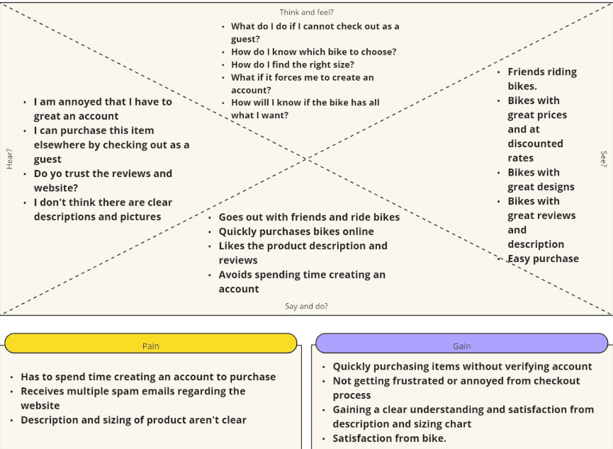
Then, I proceeded to gather the information from the interview and create a thematic analysis. I looked for patterns and grouped the data into themes. I found that most users prefer to checkout as a guest whenever possible and avoid creating accounts. Users also prefer to read through the product description and sizing guide when purchasing online. Creating this helped me organize my data to aid me with further synthesizing the research and creating an empathy map. The empathy map helped me understand my target audience by considering why users want to purchase bikes, why it is important to purchase bikes promptly, and understanding what pain points users go through.
Define
Following the insights uncovered in the empathy map, I decided to create a red route that allows users to purchase a single bicycle as a guest. This route will allow users to have all the information necessary to make an educated purchase for the product they want. Per the research, it is important to have all the necessary information, such as description, size, dimensions, wheel size, gear size, etc., to obtain the next bike.
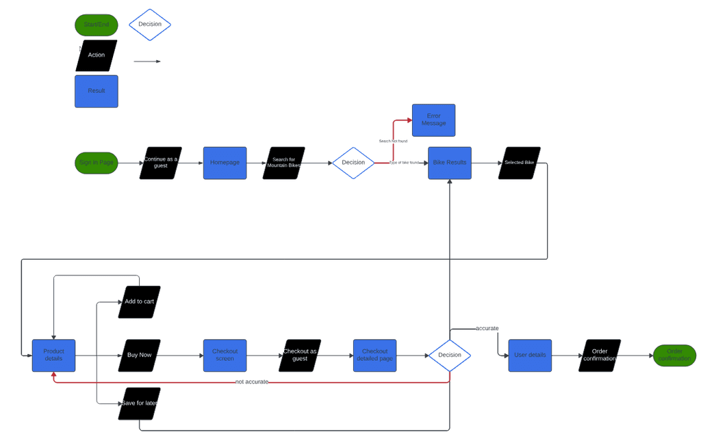
User Flows
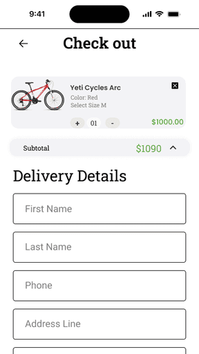
Next, I decided to identify a red route where users can quickly purchase a bike of their choice by having the necessary information about the bike while also checking out as a guest. One of the major pain points was not having the option to check out as a guest and not having the necessary information on the bike. Therefore, I included the option to checkout as a guest, and allow users to either add to cart, buy now, and save for later since purchases can be saved if users decide to leave.
Design and Validate
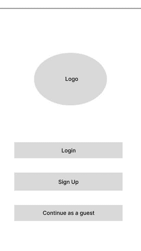
Lo-Fi Wireframes
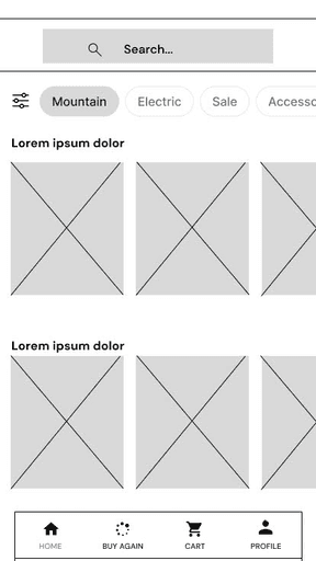
Due to time constraints and having existing wireframe in this project, I decided to move into low-fidelity wireframing and design red routes. I rapidly created Cyliqs UI with the inspiration of various competitor apps and focused on creating the following workflow: purchasing using a guest feature, navigating through the size chart, specs, and reviews, along with successful purchase of the product.
Validate: Round 1
Using these low-fidelity wireframes, I created a prototype to conduct some usability testing. This allowed me to understand some initial problems users faced at an early stage. I conducted this testing across five different participants. Below are some of the usability problems:
Users were unsure when the item would be shipped. Users were confused because they were not prompted with a shipping option
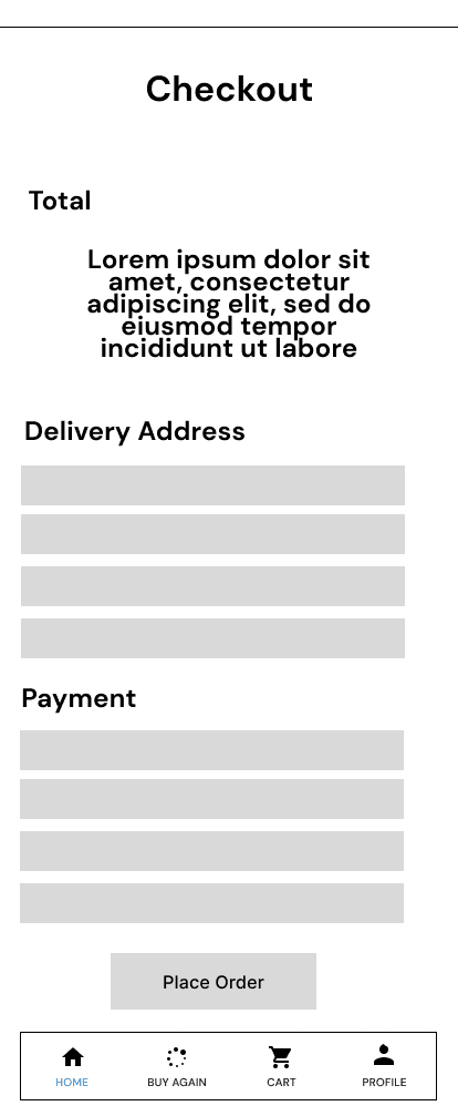
Users were also concerned with not seeing the total price breakdown at the end of the checkout. Users stated they wanted reassurance before they placed the order and preferred to have the total charge before purchasing across different checkout screens.
There were some minor issues that users encountered such as the product not containing a size option and different color options for the product.
To avoid as many pain points as possible and create a seamless checkout experience, it was important to make iterations to the initial wireframes before creating a hi-fi prototype.
To address the first issue, a shipping option was added to a screen along with the estimated delivery time on the confirmation page.
To address the second issue, the total cost was integrated across the different checkout screens to keep it consistent and reassure users.
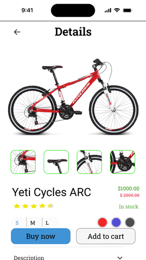
Colors and different sizing options were added to the product on the product detail page for users to choose from.
Hi-Fi and Prototyping: Round 1
In the next step, I created high-fidelity mockups for Cycliq in Figma. I used icons from Iconify and reference two UI kits from EarthBikes and E-Commerce Bicycle app. Due to the project's preference of having a serious, loyal/trustworthy, and focused aesthetic, I decided to go with the colors: black, blue and green to resemble these characteristics.
Validate: Round 2
Using these screens, I created an interactive prototype to use in the second round of user testing. The goal was to see if the app worked as intended and determine the experience was seamless for users to purchase high quality bicycles. The usability test was conducted across five different participants. The tests addressed the following issues:
Users did not see enough reviews. Users wanted to see the “Bad” reviews along with the “Good” reviews in order to compare.
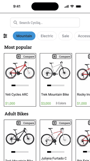
Users wanted to see more pictures of the product. They wanted to identify different angles of the product.
Users were also confused why the discount rate did not appear in the home screen page of the product.
Hi-Fi and Prototyping: Round 2
The following adjustments were made to the prototype for the tests:
Add a review section so users can read a variety of reviews and compare.
Allow users to see multiple pictures of the product to further increase confidence.
Integrate the discount in the home screen so users can quickly gravitate towards the product and potentially purchase the item for the company
Conclusion
The main goal of this project was to increase revenue through purchases in the mobile app by creating a seamless experience in the checkout and browsing. I created a design where users can feel confident when reading all the information about the bikes. Users can quickly navigate through the important information about the bike such as specs, size charts, reviews, and descriptions. I also designed the app to have a guest feature to allow users to avoid making an account and decrease the steps in checking out.
The project was completed after the second round of testing and iteration. Further testing should be conducted to obtain more insights on the insights of users along with additional red routes/features such as comparing different bikes to side with users decision making.
This project was challenging but also very rewarding. Having a time constraint on this project made me carefully decide how much time to spend on each part of the design. It taught me how important it is to meet deadlines. It was also very challenging because I had to quickly transition over to low-fidelity wireframes without any sketches. I had a challenge with the design aspect of the project since I had no sketches to reference. Nonetheless, I was able to use UI kits and competitor analysis to aid me in coming up with the hierarchy of the design. Overall, I was able to stay within my project plan, develop my Figma skills, and develop my research skills.