Tiny Tales
Quickest Book Finder For Kids
Background
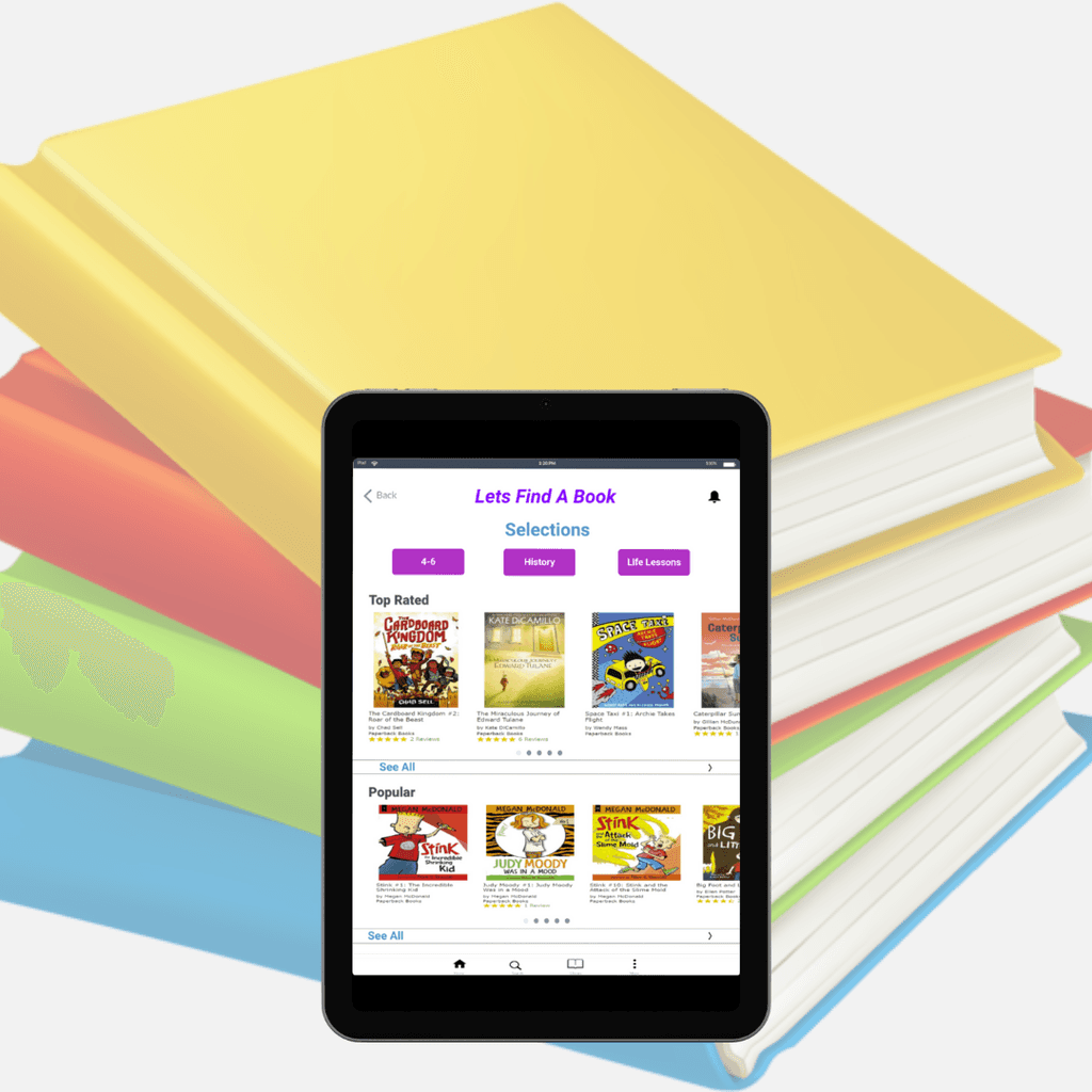
Tiny Tales is an e-book library that helps parents find books for kids.
Parents use Tiny Tales for quick access to find books to read to their children
Role: UX Designer
Timeline: 5 Days
Tools: Marvel, pen and paper, bitesize UX, Google Meet
Goal
The goal is to help Tiny Tales enhance the experience for parents by quickly identifying books parents want to read to their children.
Challenge
Parents want meaningful books to read to their children.
Overwhelming amount of books to choose from.
How might we help parents quickly find meaningful books to read to their children?
Time Period:
5 Days
Role:
UX Designer
Tools:
Marvel, pen and paper,
bitesize UX, Google Meet
Background
Parents of young children want their children to read books for various purposes such as: education, to teach life lessons, cognitive development, etc. With so many kids' books in the world, it can often be very overwhelming for parents to find the right book to read. Although there are many digital book apps, it can still be difficult for parents to agree with their children on which books to read. Tiny Talks attempt to create a seamless experience for parents to find a great story for their children to read
Problem
The fact that there is a large library of books, parents waste time finding the right stories to read to their children. Parents find themselves spending less time actually reading to their children. Being able to spend more time reading to their children will help parents become more satisfied with their children's development.
“How Might We help parents quickly find books to read to their children”
Solution
The goal is to help Tiny Tales enhance the experience for parents by quickly identifying books parents want to read to their children.
During this five day modified design sprint, I prototyped a solution that would quickly allow parents to filter through books they want their children to read.
Role
As the UX Designer, I ran a solo modified version of the Google Venture design sprint. For this case study I synthesized pre-filled user research. I then proceeded to build a high-fidelity prototype and conduct usability testing.
Day 1: Mapping Solutions
Synthesizing Research
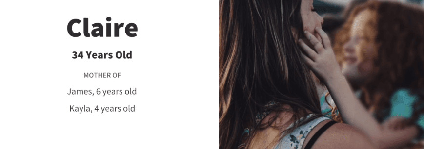
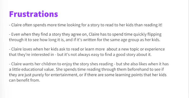
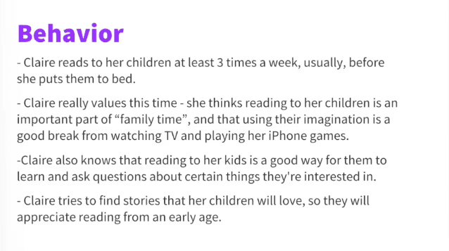
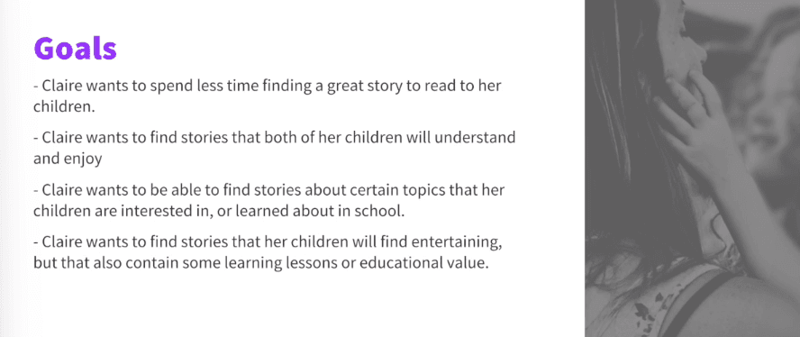
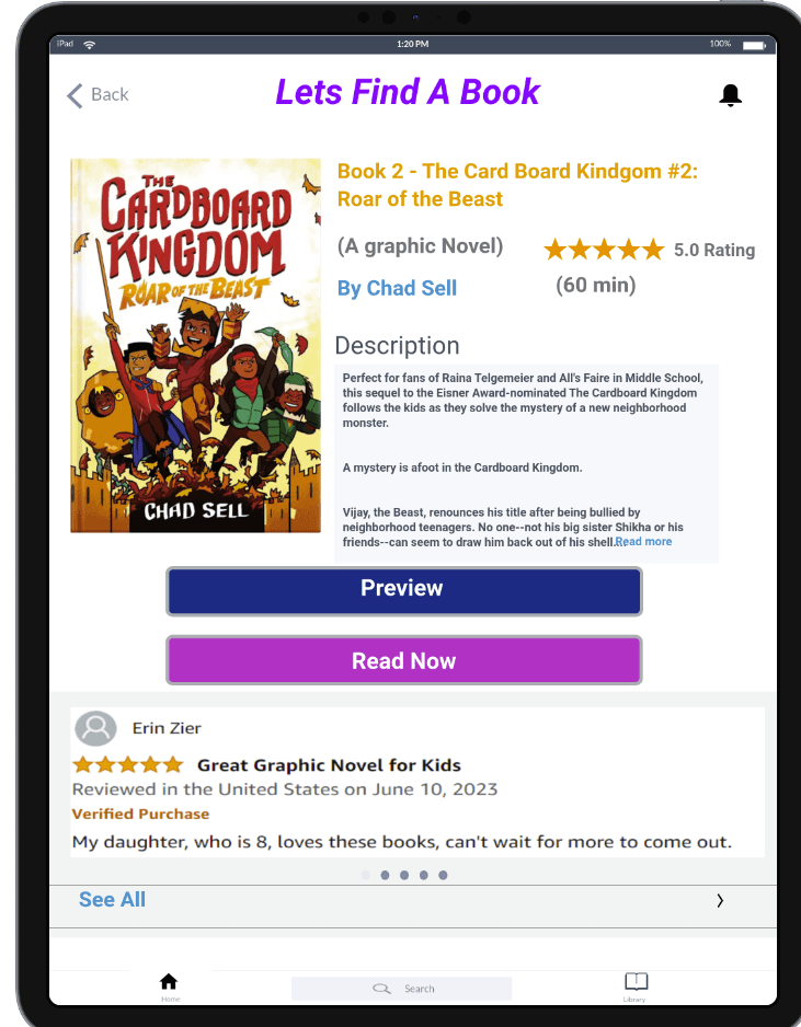
First, I had to read through the pre-conducted user research and recorded interviews with parents who use online books. Through all the research, I developed a few key insights. I learned that parents want to find books that have meaningful experiences and educational values to read to their children. I also learned that when parents choose books they focus on the reviews and ratings. Moreover, parents often want to preview the book before moving forward with reading. By quickly finding these deal breakers in books, parents are able to waste less time finding books and spending more time reading.
End-Maps
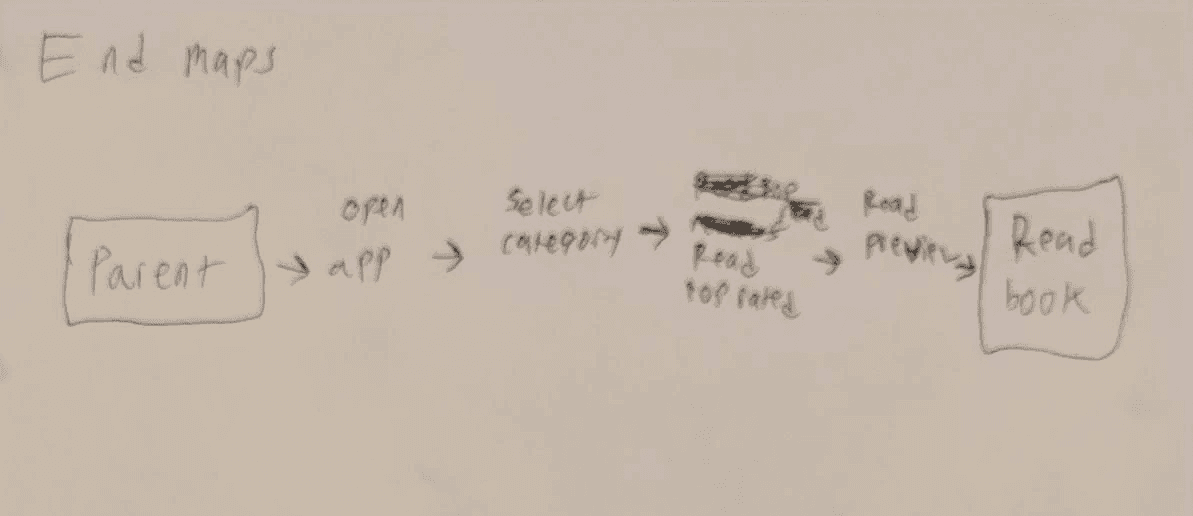
Then, I quickly mapped out four End to End experiences for the Tiny Tales app. These maps help me visualize how users will potentially accomplish their task of quickly finding books. I decided to go with my first End to End honey map as a blueprint for my design.


Day 2: Sketching
Lighting Demos
The second day of the design sprint began with a single round of lightning demos in order to look at existing solutions from competitors. As I analyzed three competitors, I focused on the main user goal of searching for specific categories, reviews, and the previews of the books. I focused my research on three demos: Play Books, StoryOnline, and FirstBook.
First Book
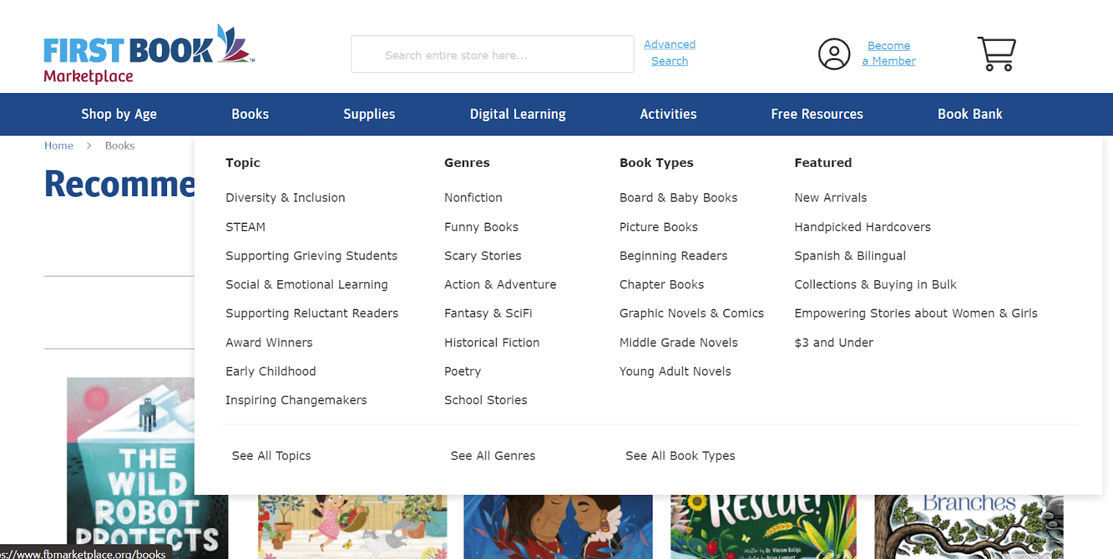
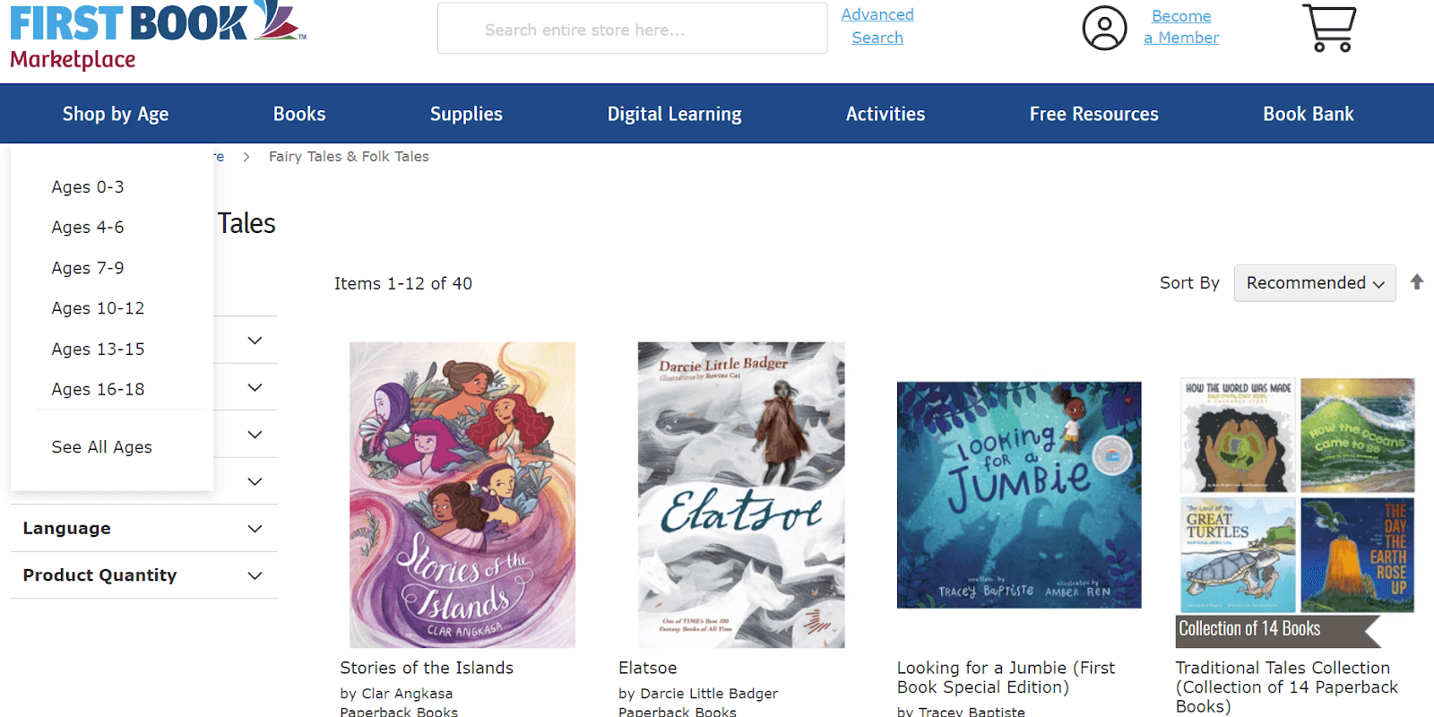
The "FirstBook" website mainly focuses on buying affordable books. Users are able to shop mainly through age groups, or learning topics. The majority of the library is educational books for kids. Books on the website are to be mainly bought for physical reading or Rereading. Some books on the website lack reviews for users.
StoryOnline
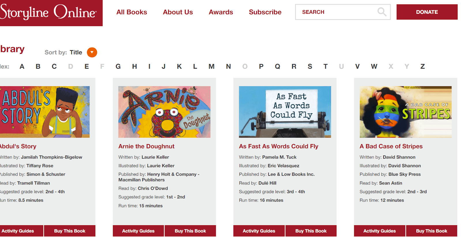
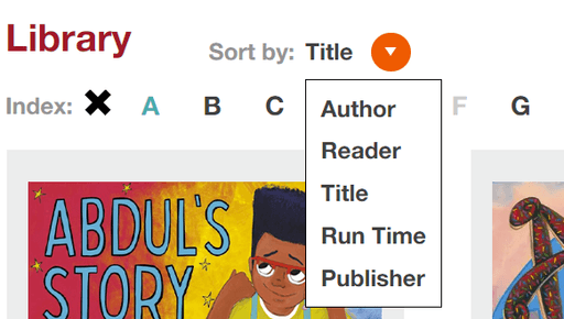
The "StoryOnline" website allows the user to watch a video of the book, buy the book, and allows the user to read a quick description. This website also allows users to search for books through different titles and through alphabetical order. Users are also allowed to access activity guides for the books that parents can access. It can still be difficult for parents to quickly find books due to the minimal filters.
PlayBooks
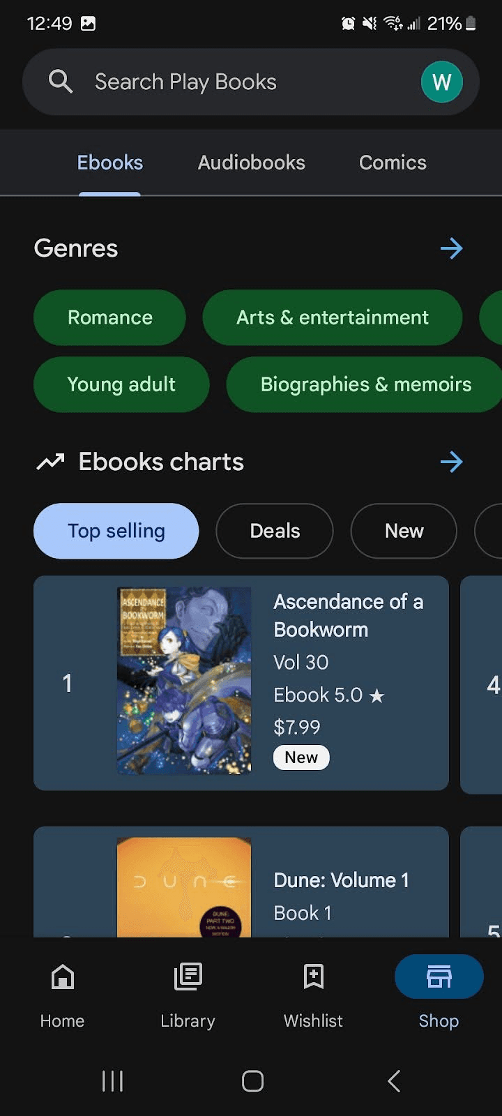
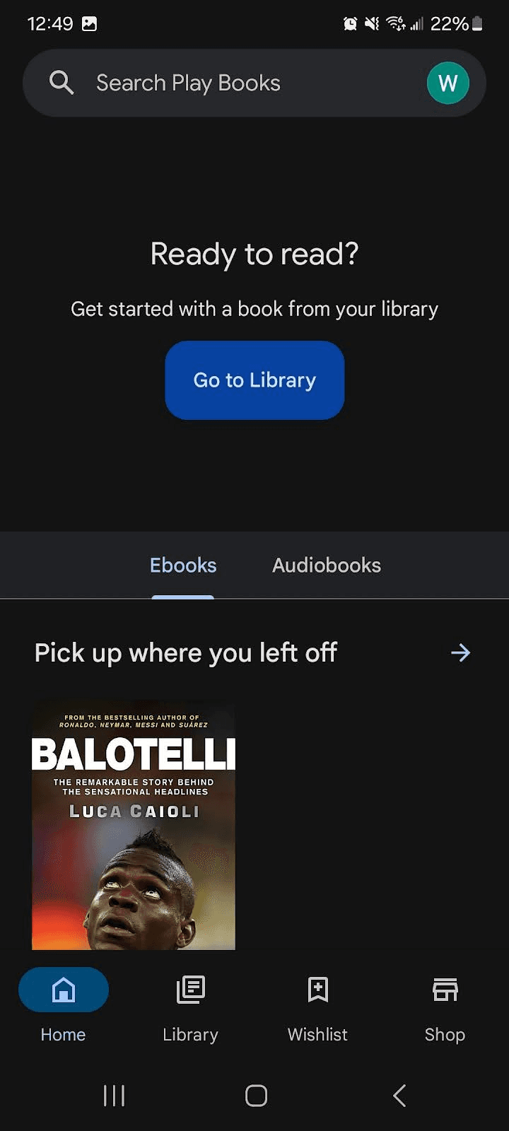
The "PlayBook" Google app is popular when it comes to reading books for all users. It does not tailor towards children and parents, but the navigation is very seamless. PlayBook has the option to buy Ebooks or audiobooks. It also gives the user the ability to search or filter through multiple categories.
Sketching the critical Screen
I proceed to use the Crazy 8’s method to sketch eight different screens in eight minutes. This method aided me to quickly ideate the most critical screen. I decided to go with the seventh screen because of simplicity to help users quickly filter through books they want.
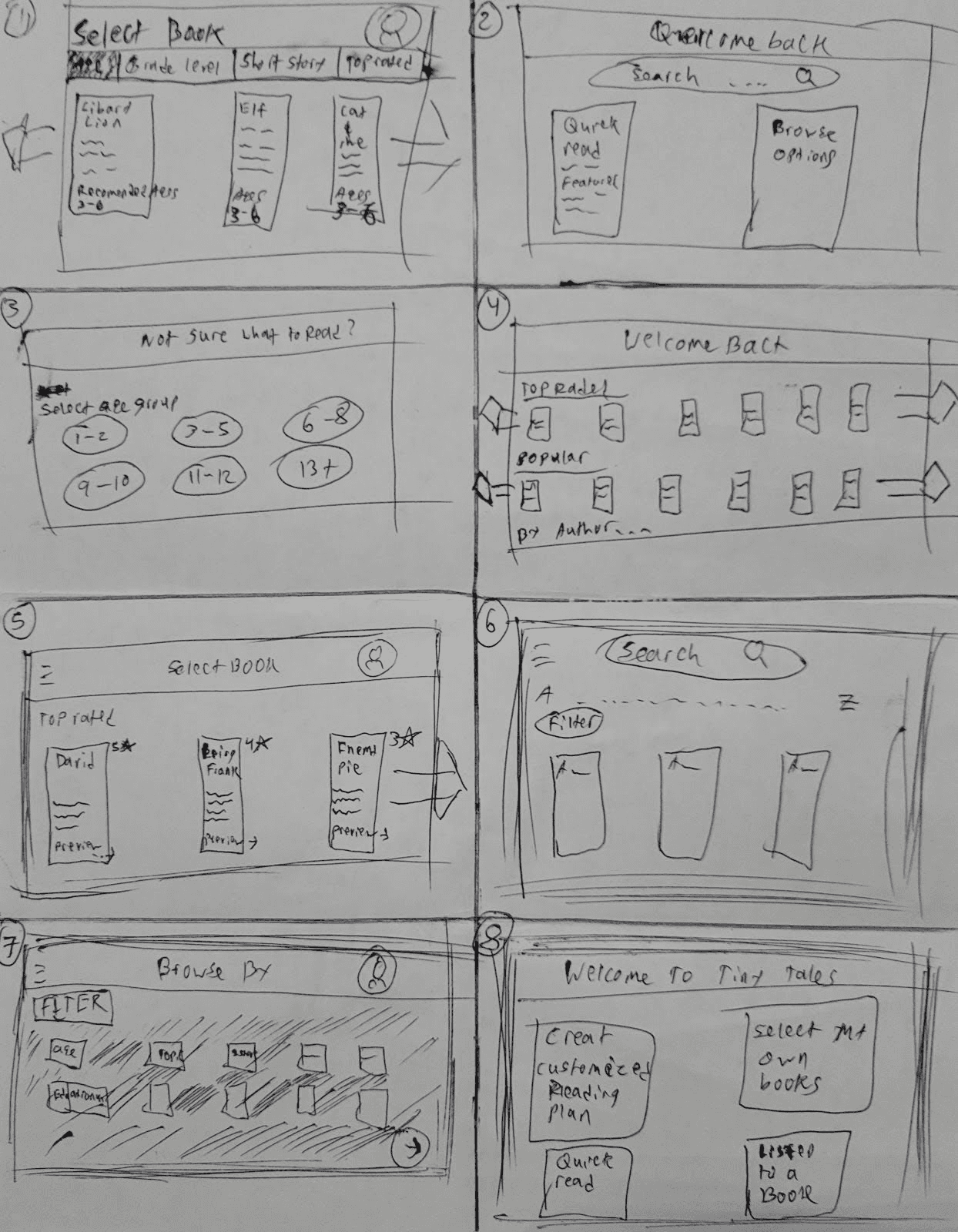
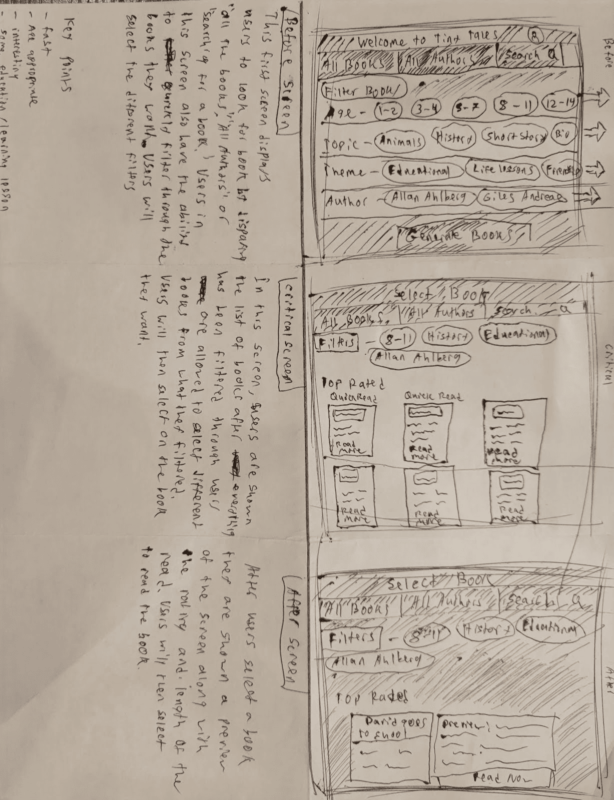
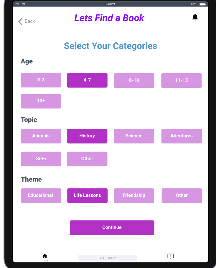
After the Crazy 8s designs I then decided to choose one of my sketches and continue to redefine. Since parents need to quickly find books with good ratings and books that fulfill their expectations, I decided that having a screen with multiple categories/filters was important to have. After the user selects the different categories, the app will proceed to show the user a selection of books with the best ratings. While keeping the format simple and standard, it would allow parents and their children to use it together.
Day 3: Decide
Storyboard
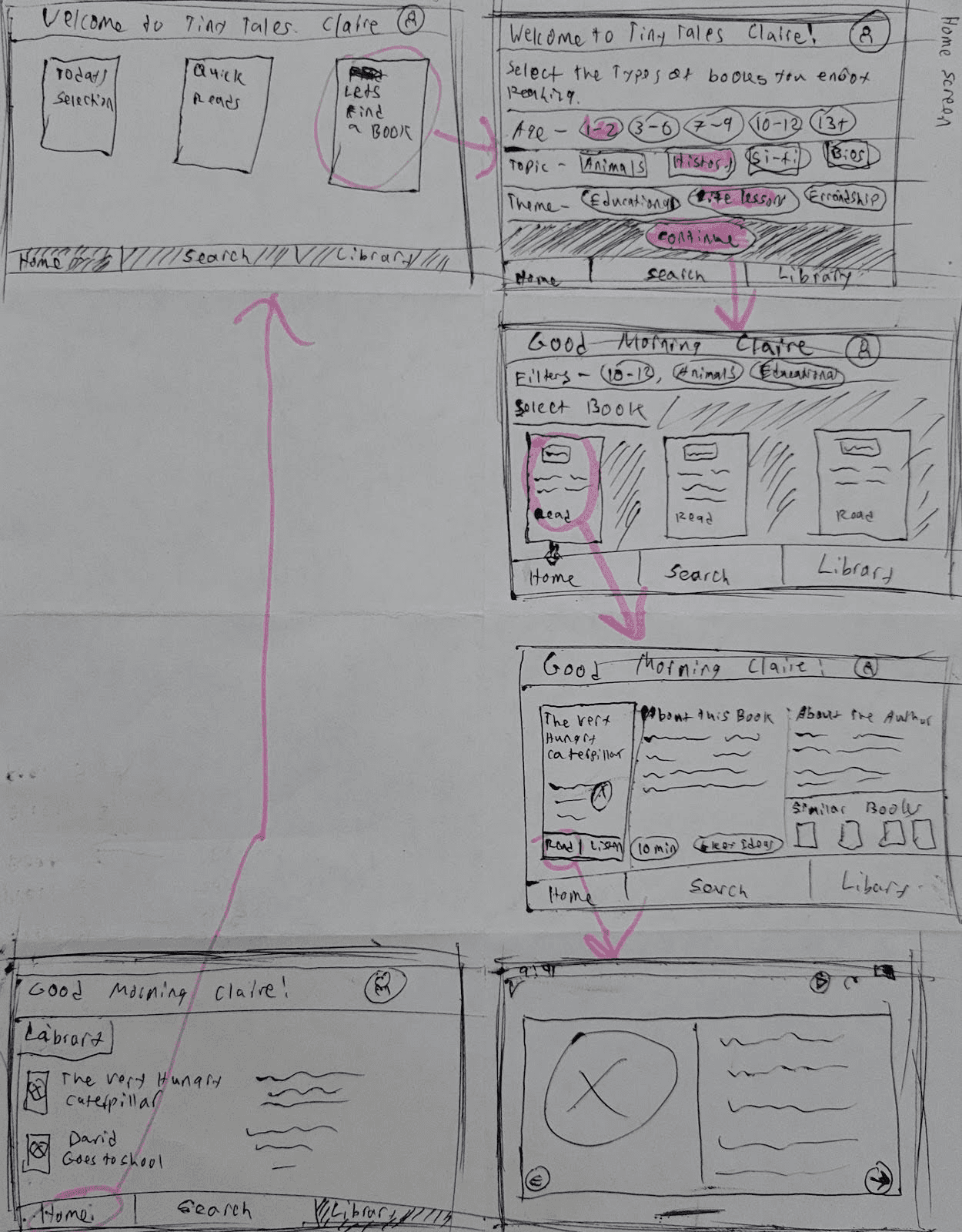
Day three of the sprint design came down to focusing on critical flow of the app. I mainly focused on reducing the steps it took parents to find books, since the purpose is to aid parents to quickly find books to read to their children. It was important to focus on the user persona here to help guide through the design process. Ultimately, I focused on giving the user multiple options to quickly find kids books. I mainly focused on having three main categories: age, theme, and topic, when parents filtered through.
Day 4: Prototype
Building the Hi-Fi
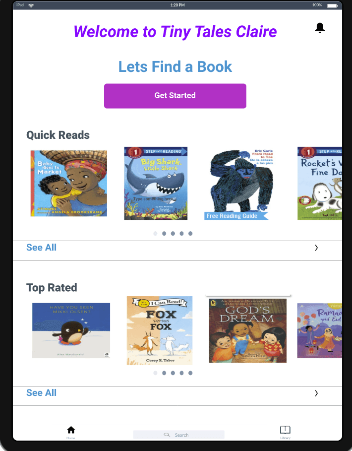
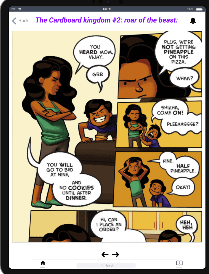
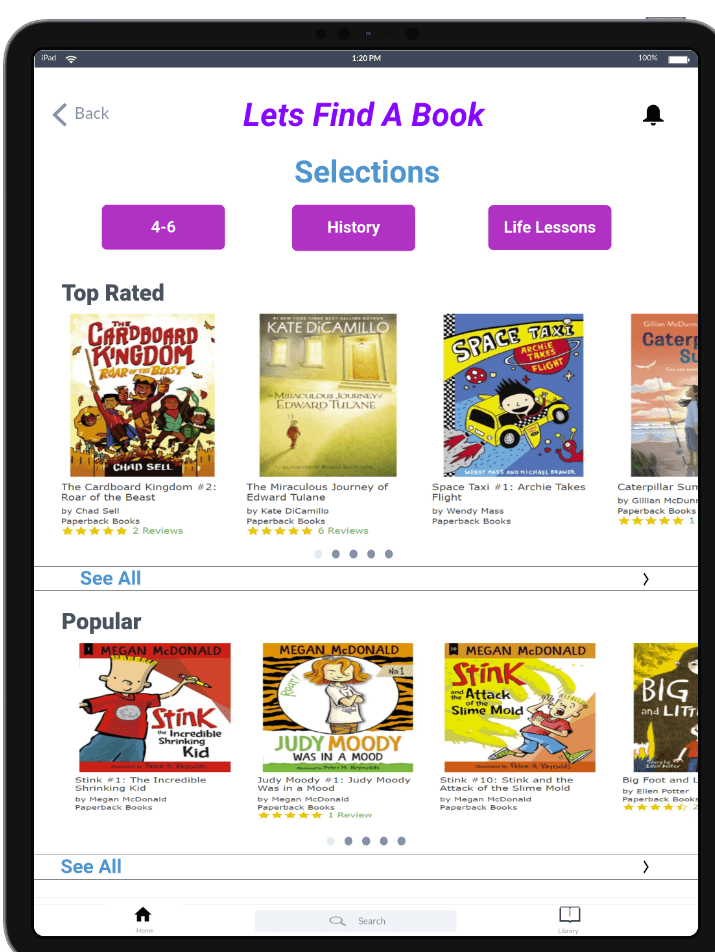
The fourth day of the sprint design consisted of developing the storyboard into high-fidelity prototypes for user testing. I used inspiration from different apps and book cover pictures from websites. Using this information I was able to create organized screens. I used Marvel, a UI design program, to quickly create a prototype and used purple and white to have vibrant buttons for calmness.
Day 5: Validate
Usability Testing
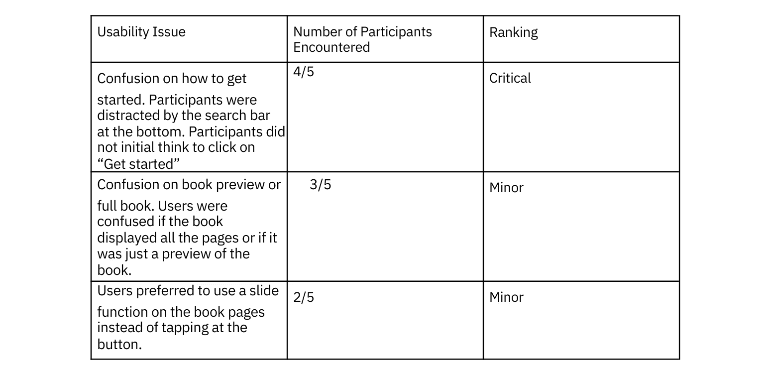
Day five of the design sprint consisted of testing the prototype with five participants. Most of my participants were either parents or had childcare experience. The participants were able to quickly navigate through the app and access a book of their choice. I gave my participants 4 tasks to complete on the app. I focused on how participants would navigate through finding a specific book, selecting different categories, and reading a preview of the book. I found a few consistent pain points regarding how to start with the search and if the book was a preview or not.
Recommendations and Future Iterations
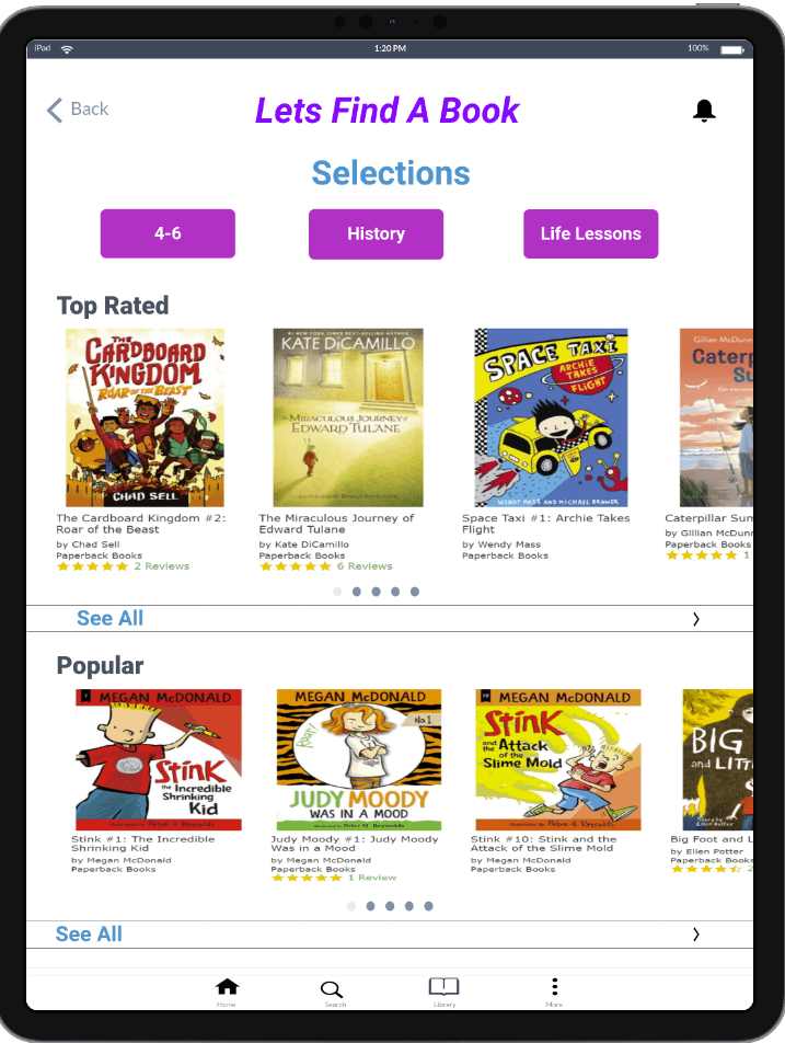
One of the major usability problems was the bottom navigation. Users were confused about what the search Icon displayed. To fix this issue, the bottom navigation tab will be changed into just 4 different icons across the bottom. This will help users focus more on the “Get Started” button at the top for parents in particular to focus on finding books.
The second usability problem was the fact that some users were confused if “Read Now” showed the entire book or just a preview. In order to fix this problem a preview feature can be added to allow parents to distinguish between the entire book and reading a few pages before.
One minor problem users faced, was the confusion on sliding between pages and navigating using the arrows at the bottom. This issue can be fixed by simply just allowing the user to swipe through pages and removing the arrows at the bottom.
Iterations
As I completed the second round of user testing, I took all the feedback received and implemented it into a final prototype. The final iterations consisted of making edits to some cosmetic components within the prototype.
Conclusion and reflection
All things considered, this was my first time using the Google Ventures Sprint Design. The five day spring was very challenging in itself because it truly forced tight deadlines and critical paths for the app. Given the time limit on the process, I truly enjoyed being able to work at a fast pace and focus on one problem.
Most of the participants enjoyed using the app, they believe if they all had children they would use it. Moreover, in order to make this app more accessible I would like to incorporate audio books; for accessibility purposes they believe it can attract a different group of users. This could be implemented in future iterations along with testing more parents with one or more children.
Given the limitations of the design spring, I was able to quickly create a design that my participants enjoyed. I would enjoy conducting more design sprints in the near future and work alongside others.