Time Period:
4 months
Category:
Social
Role:
UX Designer
Tools:
Figma, Google Forms,
Canva, Google Meet
Travel Pal Case Study Overview
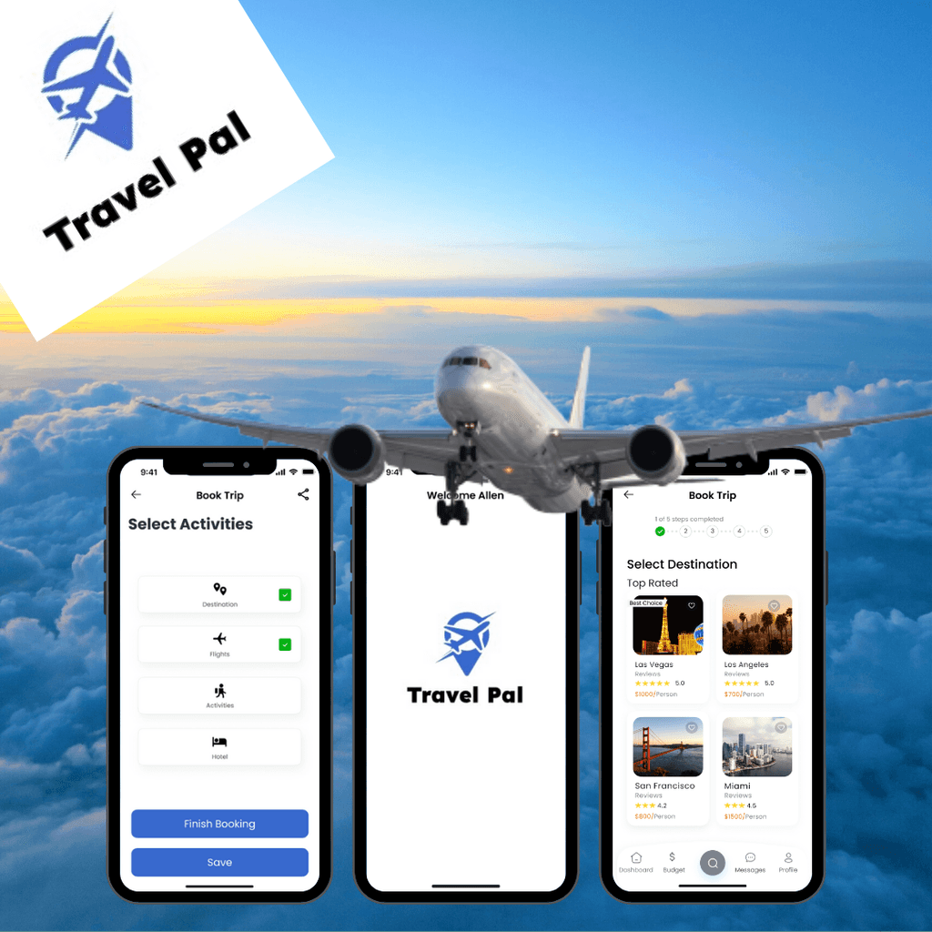
Travel Pal is an traveling app that allows users to book their entire trip in one sitting. The app allows the traveler to complete the following: select a destination, book flights, hotels and choose an activity package. The app focuses on creating a seamless experience for travelers to primarily quickly book trips while collaborating with others.
Background
Problem
People around the world usually are able to take time off work to take trips. People often spend time planning their trips and comparing options. This situation causes frustration which leads to people rethinking if they should take trips or even obstruct their entire travel experience. Travel Pal aims to reduce the frustration and create a seamless and stress free planning experience.
Solution
The goal was to create an experience that allows users to book the best items in one app. Instead of users going back and forth comparing deals, Travel Pal focuses on giving the user all the items necessary for a booking. Users are allowed to book flights, hotels, and activities along with destination selections as well as share it and messaging friends within the app.
Role
As a primary designer, I was responsible for user research, research synthesis, design and ideation and user testing. I created a project plan that set deadlines which extended across 4 months.
Research
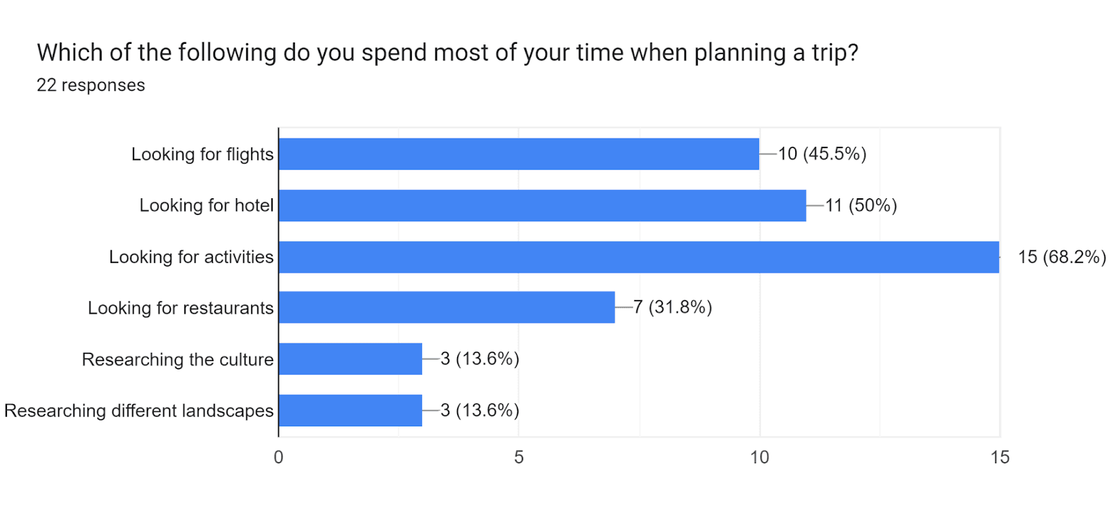
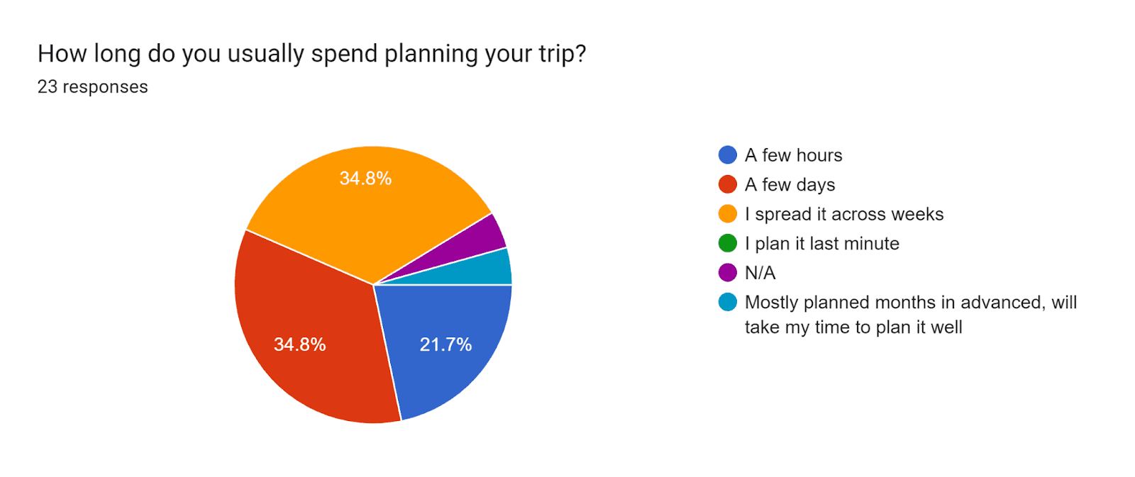
I began the research process by investigating research studies and articles. I also focused on obtaining a deeper understanding of my target audience and the painpoints they face. In order to gather these insights, I distributed a screening survey to various individuals. I received a total of 20 responses and selected individuals who have traveled at last once per year and who like to plan their trips. I proceeded to conduct in-depth interviews with these selected individuals.
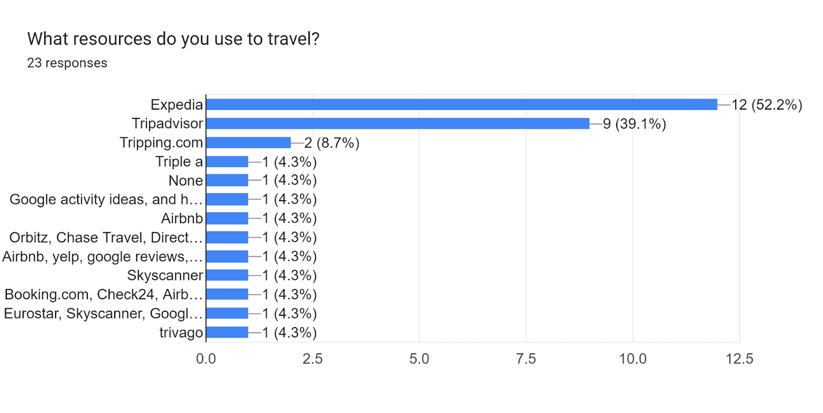
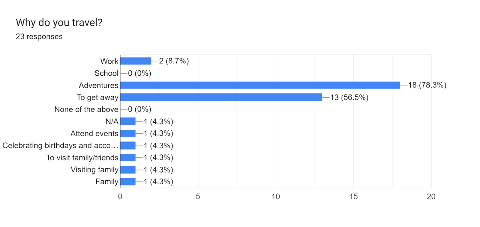
Survey Results
Interviews
Due to time constraints I selected three participants from the screening survey and proceeded to conduct informational interviews to gain a better understanding of my users: values, motivations, routines and pain points. These interviews were conducted remotely utilizing an interview script with open ended questions.
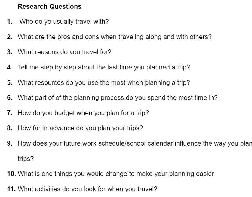
Sample Interview Questions
Research Synthesis
Affinity Mapping
In order to synthesize my research, I created an affinity map to find and group major themes. I found that users had multiple similarities. For example, I learned that most users tend to use more than one site when booking a trip. Some started to use Expedia then used Trivago to find the best deal. Some claim they always check other sites because they look for better deals. I also learned that users almost always look at the reviews before a booking because they want to know what others think. Moreover, users expressed their importance on communication among others when planning. Users almost always travel in groups, therefore, it is important for everyone to be on the same page.
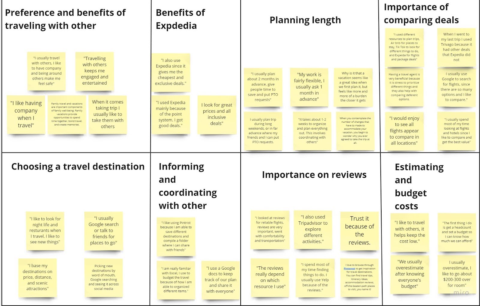
Affinity Map
Empathy Map
After grouping insights into themes, I then created an empathy map to better understand the goals, needs, experiences and behaviors of my users. I used quotes from my interviews to organize insights, observations from my interviews.
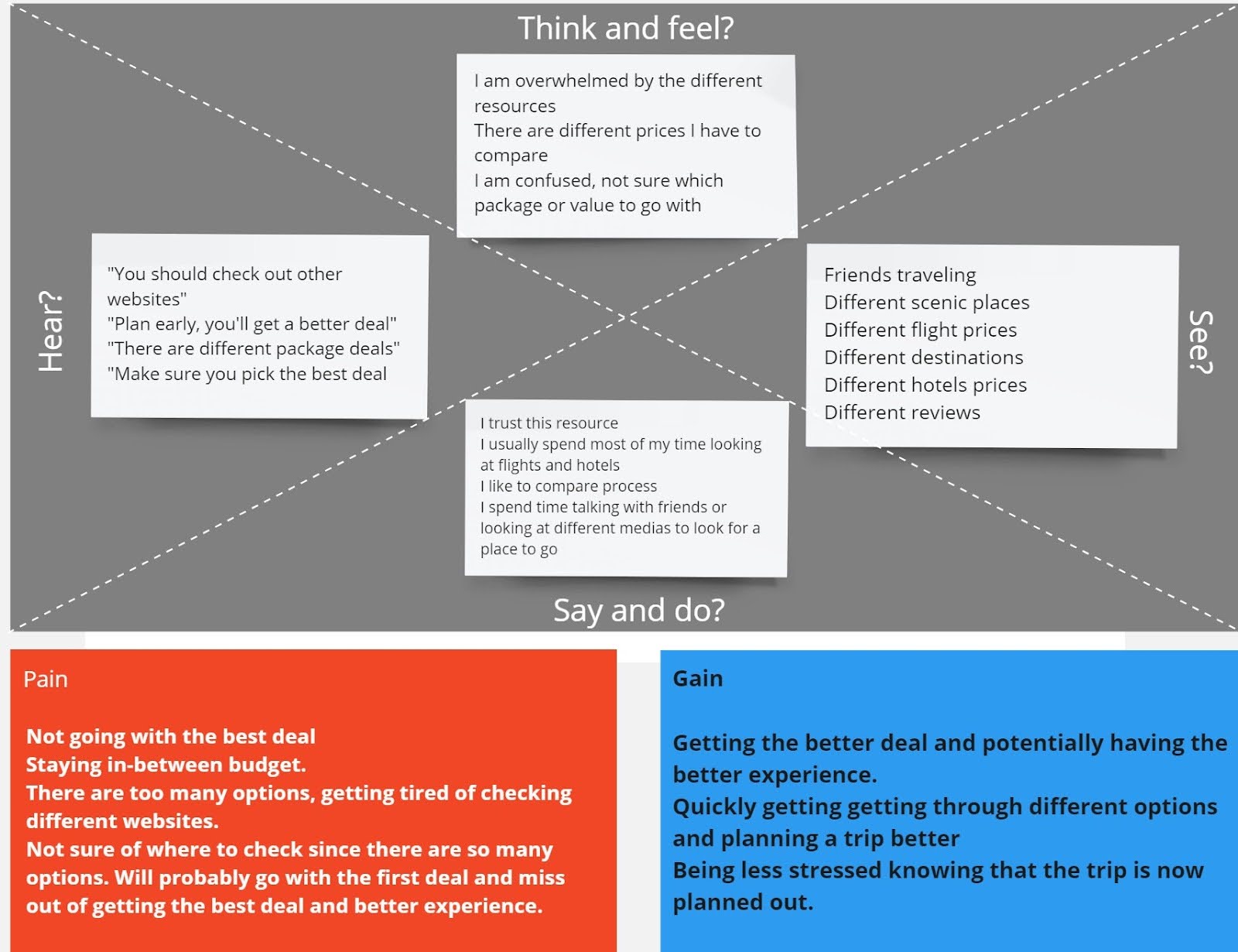
Empathy Map
Persona
In addition, I developed a persona to help guide my design towards a target audience. I updated this persona throughout the process as I gathered additional information.
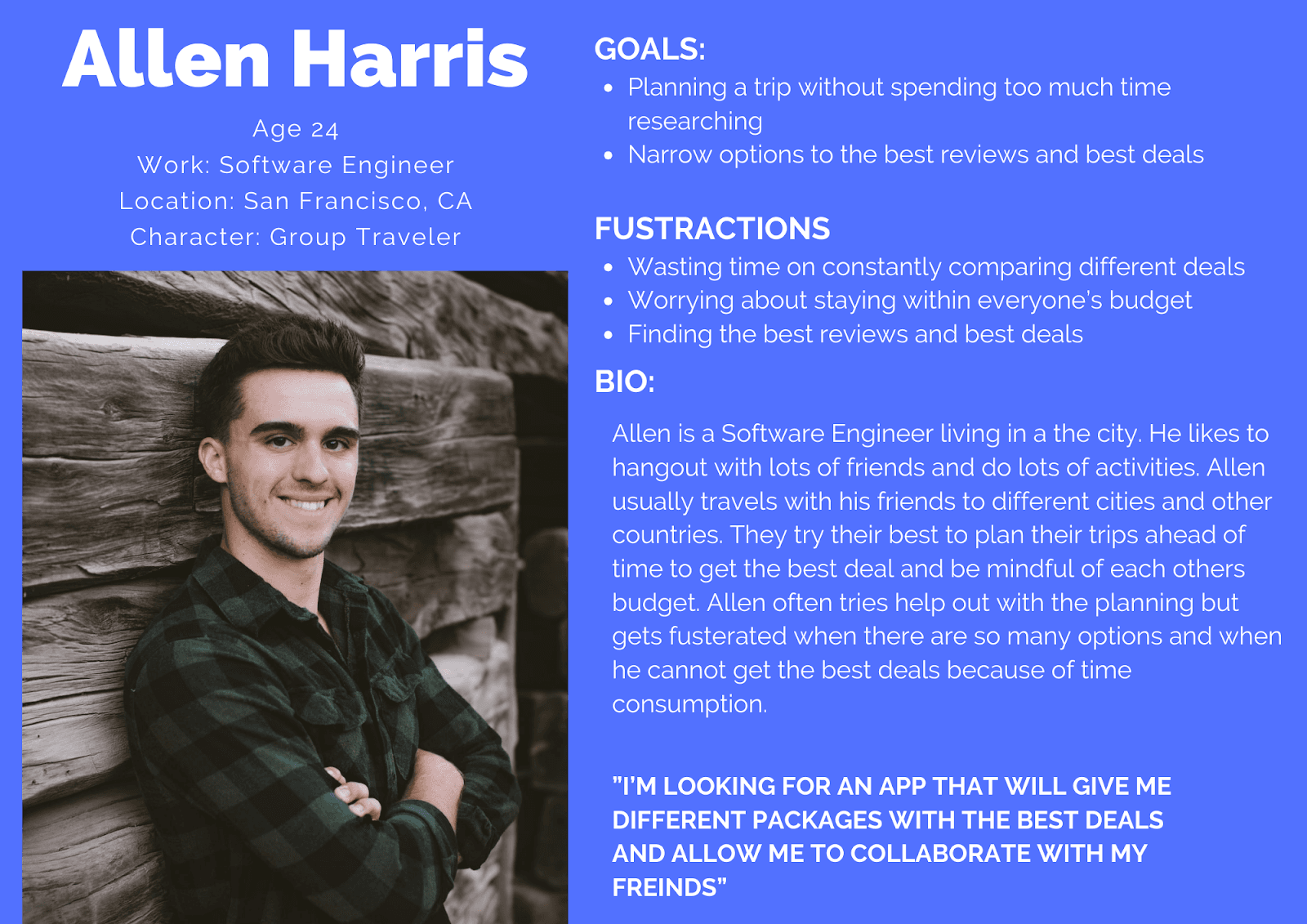
Persona
Define & Ideation
How Might We
After the completion of my research, I decided to focus my app design on three actionable items known as “How Might We.” This helped me with focusing on actionable designs.
How might we support travelers to quickly plan their trip?
How might we help travelers effectively collaborate effectively with others?
How might we promote travelers to primarily see the better reviews
User Flows
Next, I used the HMWs and began to develop site maps that would aid with the critical flows known as red routes. These sitemaps aided as blueprints for the development of my sketches. The site maps were focused on booking an entire trip from start to finish, how to collaborate with others and share itineraries, and setting a budget. Based on the research, I determined that the app should have a collaboration component, and also allow users to book the main items of their trips such as: flights, hotels, and destinations, since travelers usually book multiple items.
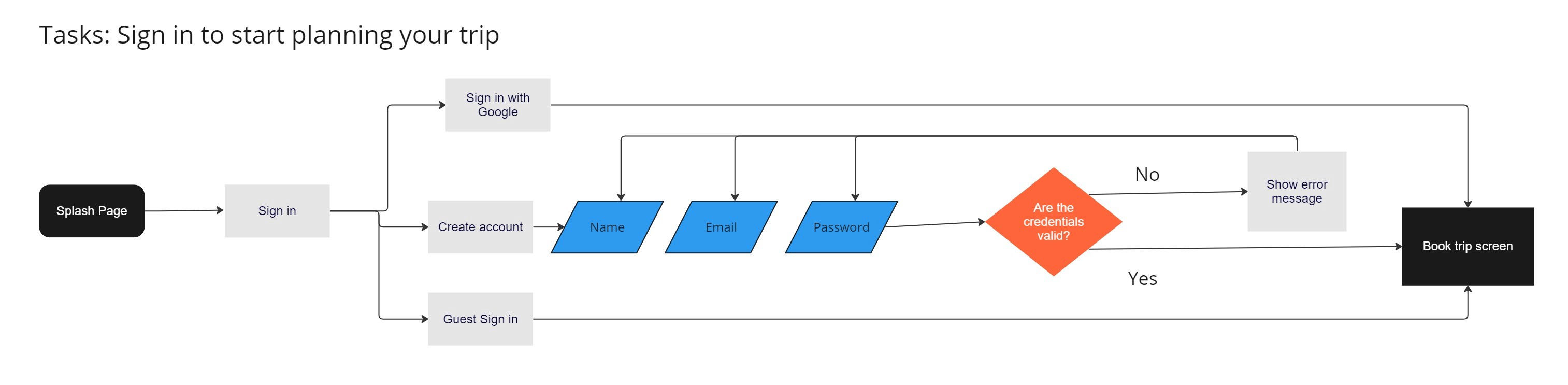
User Flow 1
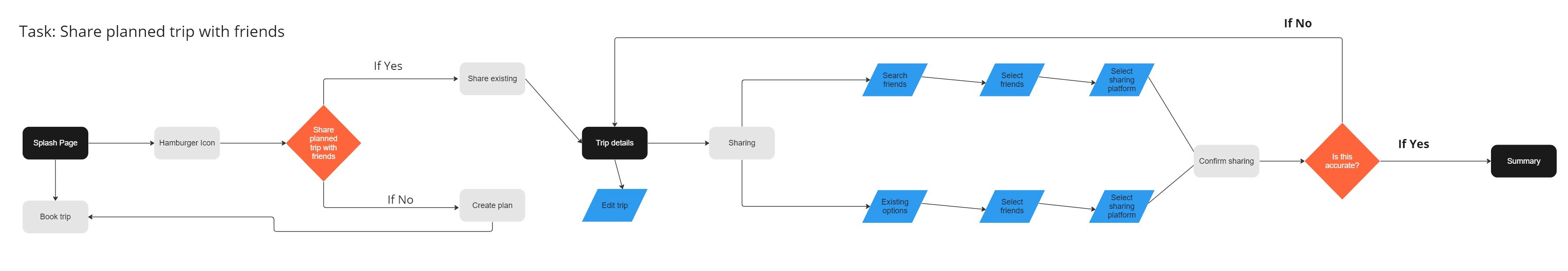
User Flow 2
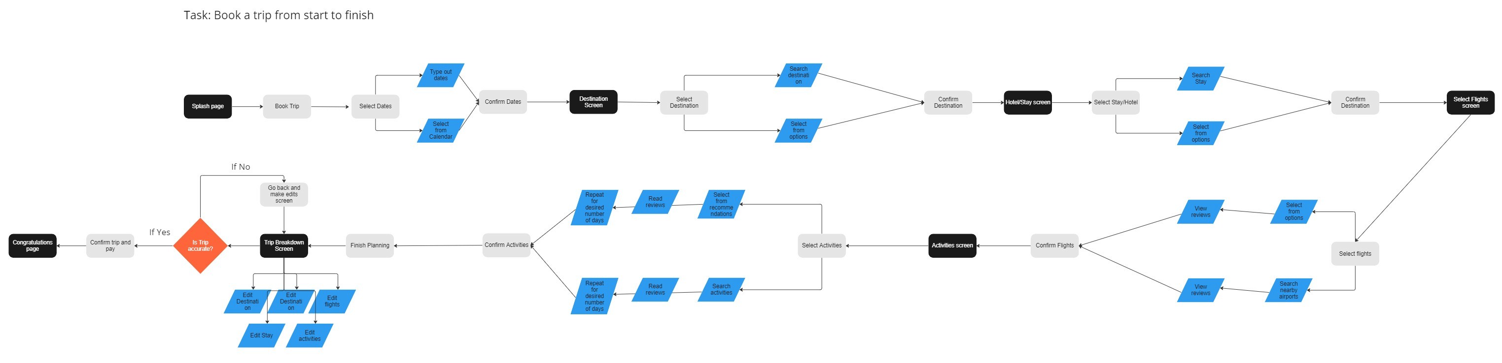
User Flow 3
Sketches
After synthesizing my research and defining my observations, I began the design phase by creating low-fidelity sketches and wireframes. These sketches were based on user interviews, project goals, heuristic evaluations and site maps. These sketches helped me to quickly explore different ideas for Travel Pal before committing to digital designs. Throughout these sketches I focused on incorporating all booking aspects for a trip, (flights, hotels, destination), recommendations, communication within, and a budget.
Red Route Sketches
Mid- Fidelity Wireframes
Following the completion of my lo-fi sketches, I began creating mid-fidelity wireframes. I focused my screens on three red routes. Through my research I determined that users always look for the best option when booking. I also determined that communication and staying within a group's budget is necessary for users.
Mid-Fidelity Wireframes
Style Guide
For the aesthetics of the UI design, I aimed for a sense of excitement, calmness, optimism and happiness. To convey these feelings I decided to use blue for calmness, green for excitement, orange for optimism and yellow for happiness. I also decided to use Poppins font for clear and clarity legibility. Regardless of the size, users will be able to clearly read the words which is important to capture all the information for users.
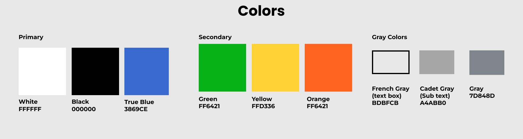
Colors
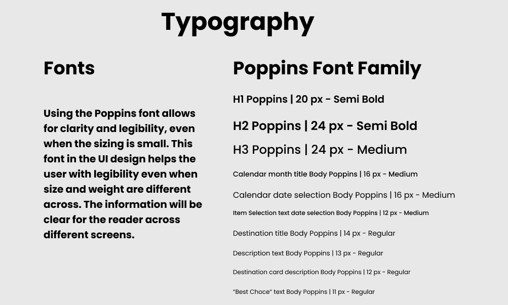
Typography
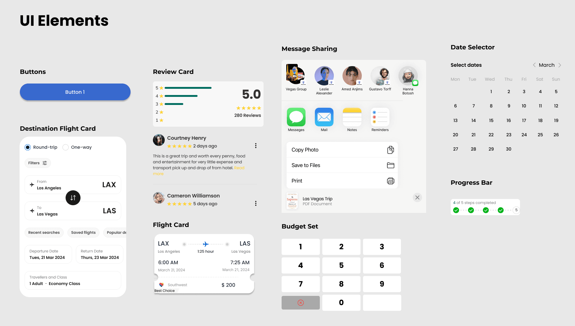
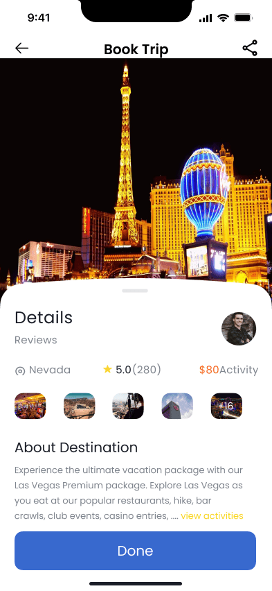
UI Elements
Validation
User Testing
The high fidelity mockups were run through two rounds of testing consisting of five participants each. There were several issues uncovered through each round.
Round 1
There were various issues encountered in the first usability round
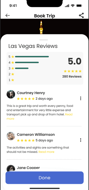
Four out of five participants were frustrated when they were not able to access the reviews of the booking.
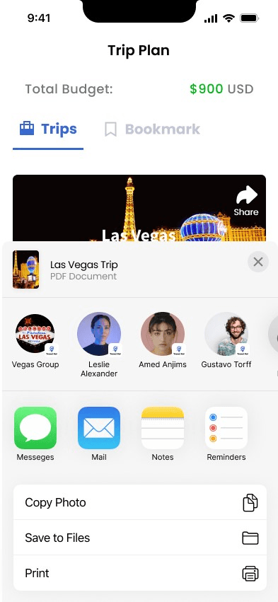
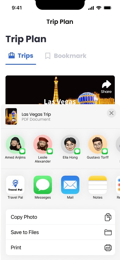
Users found it difficult on how to share their itinerary
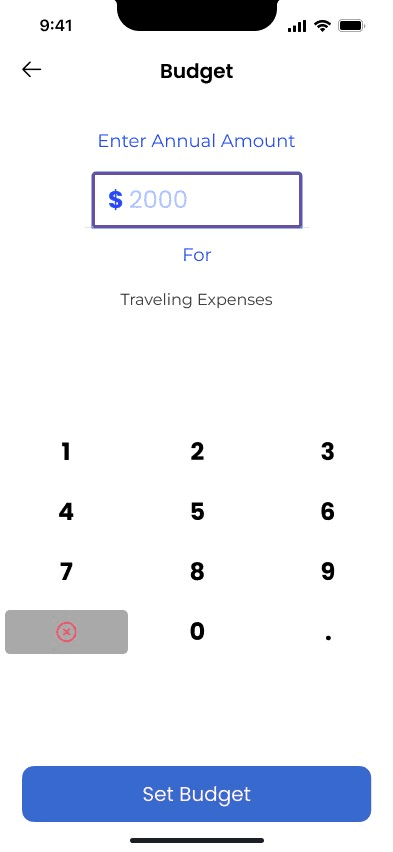
Users were confused on how to set the budget for the trip.
To address these issues, I was able to make some adjustments and proceeded with a second round of testing. For example, I add reviews for all the bookings for users to read through and reassure their decision. Moreover, I also changed the sharing feature and made the groups within the app more accessible for sharing. Lastly, I decided to remove the decimal in order for users to quickly set whole numbers and not spend too much time adding decimals.


Round 2
In the second round of usability testing, users were more satisfied and comfortable with booking the different items. Users stated they liked being able to read reviews and gave them reassurance when selecting the “Best Choice.” Moreover, there were less challenges users faced when sharing the itinerary among friends. Users liked that the sharing feature was within the app, not external. Users were able to select the contacts within the app and group chats within as well. In addition, removing the decimal, created a seamless experience for users. Participants were able to quickly set a budget for their trip with no pain points.
Iterations
As I completed the second round of user testing, I took all the feedback received and implemented it into a final prototype. The final iterations consisted of making edits to some cosmetic components within the prototype.
Conclusion
Designing the app from start to finish was very challenging but extremely rewarding. There were so many things I learned from this project. I understand how important research is in order to make any design decision. It is also important to know your target audience and to constantly revisit the persona. This project also showed me how important the user-centered design process is and to stay on track of deadlines. Moreover, this was a rewarding experience because I was able to develop my UX design skills and gain a better understanding of the process.